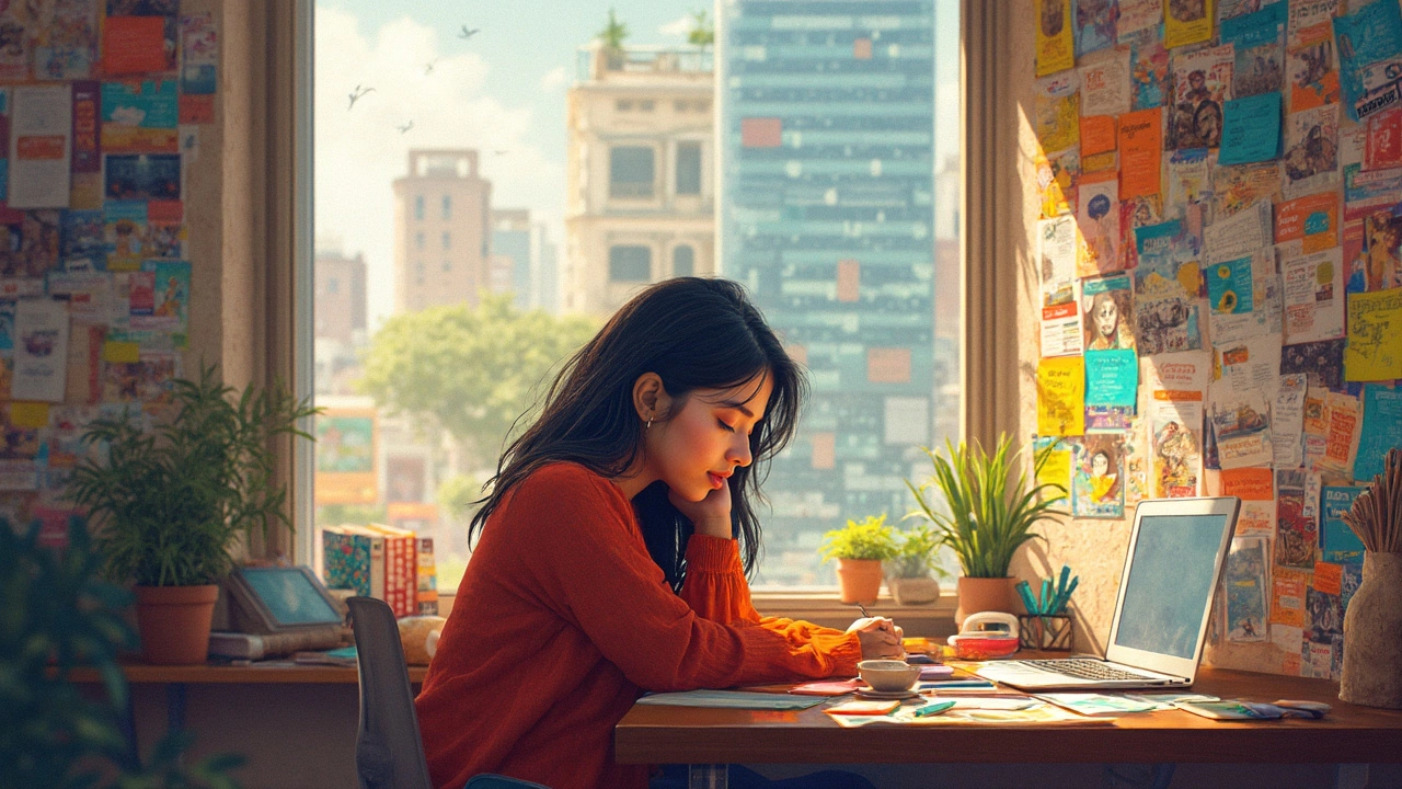
Ever sat down to design a site and stared at a blank screen for half an hour? Happens to the best of us. The secret is, most web design ideas don't just come out of thin air. They start with something much simpler—looking for inspiration in the world around you.
Maybe a menu at your favorite coffee shop, a cool app on your phone, or that one website you always end up browsing late at night. If it catches your eye or sticks in your memory, try jotting it down. That little spark could become the base for your next big site concept.
I also find it super helpful to snap photos on my phone whenever something stands out—colors, layouts, even funny street signs. Later, when I’m stuck, I flip through those shots. You’d be surprised how often you get hit with an idea when you least expect it.
- Look Around for Everyday Inspiration
- Keep an Eye on Trends (But Don’t Follow Blindly)
- Brainstorm Like a Pro
- Test Your Ideas Before You Commit
Look Around for Everyday Inspiration
If you want a strong web design idea, you don't always need to scroll endless portfolios. Most of my real breakthroughs come from picking up on things I see every day. Everyday life is a goldmine for unique design concepts.
Here’s a simple truth: people are drawn to familiar, relatable visuals. Ever noticed how the clean lines of a subway map or the bold labels at a grocery store catch your eye? Those same ideas work online. For example, the team behind the Airbnb website admits using magazine layouts as early inspiration for their visual style. The human brain naturally likes patterns—so pay attention to the stuff you use daily.
Sometimes, inspiration is hiding in other industries. Car dashboards, weather apps, public transport info boards—they all use layouts and color schemes designed to get your attention fast. That’s exactly what works in website design ideas.
- Check packaging designs at the supermarket. Product labels pack tons of info in tiny spaces without feeling overwhelming. Screenshot or snap photos when you spot something clever.
- Pay attention to physical spaces like coffee shops, bookstores, or even road signs. Color themes, font choices, and even the way items are arranged often solve the same problems you face in web design.
- When something sticks with you—a street mural, a friend’s phone lock screen, or a viral meme—ask yourself what made it memorable. Is it the color, the shape, the message?
It’s not just a theory—the Nielsen Norman Group, a well-respected user experience research firm, found that sites reflecting real-world metaphors and patterns can actually feel more intuitive to users.
If you want to get systematic, keep a digital 'swipe file' on your phone. Every time you spot a cool design element in real life, add a quick photo or note. When you’re dry on ideas, flip through and see what pops out. That’s often how I break out of a creative rut and uncover my next angle for a web design idea.
| Source | Inspiration Type | How It Helps Web Design |
|---|---|---|
| Grocery Packaging | Label layouts & colors | Saves space and grabs attention |
| Public Transport Maps | Navigation elements | Guides users through complex routes |
| Magazines | Grid layouts | Organizes lots of info cleanly |
Keep an Eye on Trends (But Don’t Follow Blindly)
Checking out what’s popular in web design is smart, but copying every trend just makes your site look like everyone else’s. Think of trends as a starting point, not a rulebook. For example, minimalism and dark mode have been huge in recent years. Google’s own Material Design inspired tons of websites, but the coolest ones twist those basics into something personal.
Study popular color schemes, layouts, and features, but ask yourself: does it really fit your project or just look flashy? Just last year, Adobe’s survey found 73% of people prefer a site that feels unique over something super trendy. That means users notice and value original ideas.
To stay updated on website design ideas, I bookmark blogs like Smashing Magazine and Awwwards. Their yearly top lists give a quick hit of what’s working. Here’s one way to actually use what you see without turning out a copy-paste site:
- Pick out a few favorite trends—say, bold fonts, sticky navigation, or micro animations.
- Mix one or two with your own ideas, instead of stacking every trend in the book.
- Try using trendy elements to highlight the site’s purpose (like using huge fonts for a tech portfolio, but maybe not for a luxury restaurant).
If you want to compare what’s on trend, it helps to see how different web design features are being used. This table gives a quick look at what’s hot for 2024 and where they actually fit best:
| Feature | Where It Works | Where It Fails |
|---|---|---|
| Dark Mode | Tech blogs, portfolios | Child-friendly, educational sites |
| Scrolling Animations | Landing pages, creative agencies | Financial or legal sites |
| Minimal Navigation | Personal brands, simple sites | Large e-commerce stores |
| Custom Illustrations | Startups, product launches | Corporate intranets |
Bottom line: Don’t ignore web design idea trends, but don’t let them boss you around. Use what fits and leave the rest. The best sites always feel current, but also a bit different.
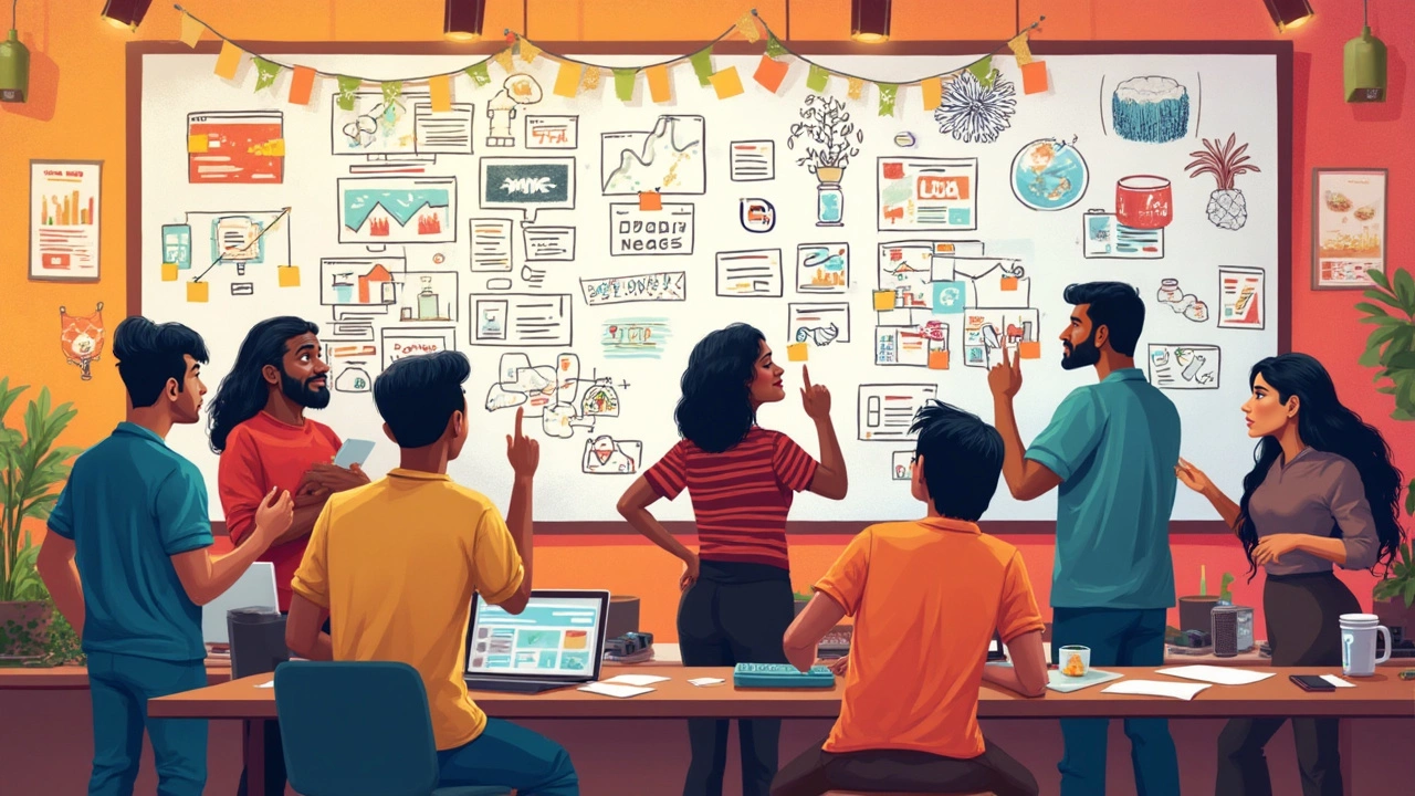
Brainstorm Like a Pro
Stuck staring at your screen, trying to force a web design idea to show up? That's when brainstorming comes in. It's not just tossing out random thoughts—there are real ways to spark smart, doable website design ideas that actually fit your project.
Start with a brain dump. Grab a notepad or open a blank doc and jot down every concept that pops into your head for five minutes straight. Don’t judge anything. This isn’t about quality yet, it’s about quantity. Research shows creative output jumps when you start with volume before narrowing things down.
Once you’ve got your messy list, group similar ideas. Maybe a few focus on minimal styles, others on bold colors, or unique navigation. Patterns will pop out once you see them collected. I like to add quick sketches—even stick figures—beside potential winners. Turns out, people who use quick visuals during brainstorming come up with 25% more usable ideas, according to a practical study from Stanford’s d.school.
- Try mood boarding using Pinterest or a mood board app. Toss in color combos, fonts, website screenshots, or even movie posters that reflect the vibe you want.
- Use the "How Might We" approach: turn problems into open-ended questions. For instance, "How might we make the contact page fun instead of boring?" Suddenly, you’ll get all sorts of creative solutions.
- Work with someone else if you can. Even a short call with another designer or a friend (my wife Nisha has stopped me from running with some goofy ideas) can help you spot blind spots and find hidden gems.
Sometimes I use random word generators and mash them up with my project goals. Sounds silly, but mixing two unrelated ideas—like "travel" and "notebook"—might push your site in a direction you wouldn’t have thought of, like an interactive journal vibe for a travel blog.
| Brainstorming Method | Result (Ideas/hour) |
|---|---|
| Solo Brain Dump | 10-20 |
| Group Brainstorm | 20-40 |
| Mood Board Session | 15-30 |
In short, don't hold back during the brainstorming stage. Wild or "bad" ideas often spark the stuff you actually end up building. Trust the process, play around, and watch your web design idea take shape.
Test Your Ideas Before You Commit
Even the best web design idea can flop if it looks cool but doesn’t work for real people. That’s why it’s smart to test before going all in. You don’t want to build a full site only to realize later that nobody gets how to use it.
Start with wireframes. They’re like blueprints—quick, rough sketches of your site layout and main features. Don’t worry about making it pretty. Focus on flow and what goes where. Tools like Figma, Adobe XD, or even drawing on a napkin work fine for this part.
- Show these basic wireframes to friends, coworkers, or anyone who’ll be honest with you. Ask simple questions: “What do you think this button does?” or “Can you find the contact form?”
- If you can, build a clickable prototype with Figma or InVision. Let a few people click around and see if they get stuck anywhere.
- Take notes on where folks hesitate, what they like, and what totally confuses them.
Here’s something a lot of big companies pay for, but you can DIY: user testing. You don’t need a lab. Just ask five people who’ve never seen your website design ideas to try out your prototype. Watch what they do, don’t just listen. According to Nielsen Norman Group, "Testing with just five users uncovers 85% of the usability problems in a design."
“The best way to find out if your design works is to observe real people using it. Their first connections, confusion, and comments are gold.” — Jakob Nielsen, usability expert
Getting feedback early saves huge headaches later. I’ve watched my own spouse, Nisha, stumble through a prototype I’d already spent hours on—her confusion tipped me off to flaws I didn’t notice myself. Don’t ignore user reactions, even from your family.
- Adjust your design based on the feedback—move stuff around, simplify steps, or explain things better if users looked lost.
- Repeat the testing. Even one more round can iron out surprises.
Here’s a quick way to compare the value of early testing versus launching “blind”:
| Approach | Cost | Fixing Bugs | User Satisfaction |
|---|---|---|---|
| Tested Prototype | Low | Easy (cheap to change) | High |
| Un-tested Launch | High (after launch) | Hard (expensive to fix) | Low |
The bottom line: a few hours of testing a web design idea can save days of headaches. Don’t skip it. The feedback you get is gold, and it’ll make your site way more usable.